
* 대회 : https://dacon.io/competitions/official/235743/overview/description
* 코드 : https://dacon.io/competitions/official/235743/codeshare/2846?page=1&dtype=vote
* 데이터
train.csv
- 일자
- 요일
- 본사정원수
- 본사휴가자수
- 본사출장자수
- 시간외근무명령서승인건수
- 현본사소속재택근무자수
- 조식메뉴
- 중식메뉴
- 석식메뉴
- 중식계
- 석식계
test.csv
- 일자
- 요일
- 본사정원수
- 본사휴가자수
- 본사출장자수
- 시간외근무명령서승인건수
- 현본사소속재택근무자수
- 조식메뉴
- 중식메뉴
- 석식메뉴
sample_submission.csv
- 일자
- 중식계
- 석식계
1. 라이브러리 불러오기
import pandas as pd
import numpy as np
import matplotlib.pyplot as plt
import seaborn as sns
plt.rcParams['font.size'] = 15

import warnings
warnings.filterwarnings(action='ignore')
2. 데이터 불러오기
path = '/content/drive/MyDrive/dacon-food-court/'

train_raw = pd.read_csv(path+'train.csv', encoding = 'utf-8')
test_raw = pd.read_csv(path+'test.csv', encoding = 'utf-8')
submission = pd.read_csv(path+'sample_submission.csv', encoding = 'utf-8')
2.1 train_raw 데이터 확인
train_raw.head(2)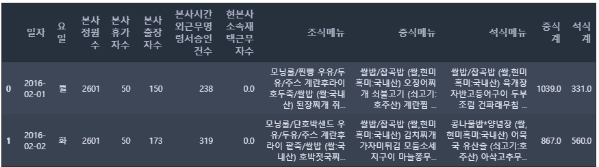
2.2 test_raw 데이터 확인
test_raw.head(2)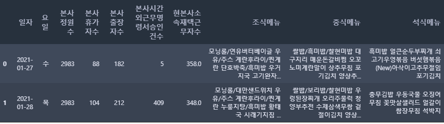
2.3 train, test 데이터 갯수 확인
print(' train shape: ', train_raw.shape, '\n', 'test shape: ', test_raw.shape)train shape: (1205, 12)
test shape: (50, 10)
* train : 1205개의 데이터, 12개의 컬럼
* test : 50개의 데이터, 10개의 컬럼
3. 데이터 전처리
3.1 컬럼명 수정하기
# 칼럼명 수정하기
train = train_raw.copy()
train.columns = ['date', 'dow', 'employees', 'dayoff', 'bustrip', 'ovtime', 'remote', 'brk', 'ln', 'dn', 'target_ln', 'target_dn']
train.head(2)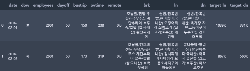
train_raw 파일을 복사한 후 train 파일을 생성하여 데이터 전처리를 한다. 데이터 컬럼명을 한글 → 영어로 변경한다.
test = test_raw.copy()
test.columns = ['date', 'dow', 'employees', 'dayoff', 'bustrip', 'ovtime', 'remote', 'brk', 'ln', 'dn']
test.head(2)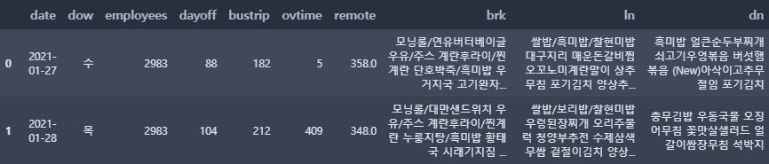
test 데이터셋도 마찬가지로 복사 후, 컬럼명도 한글 → 영어로 변경한다.
3.2 날짜와 요일(data, dow)
def to_datetime(df, date):
    df['date'] = pd.to_datetime(df[date])   # 날짜를 datetime 형식으로 변경
    df['dow'] = pd.to_datetime(df[date]).dt.weekday + 1   # 요일은 숫자로 변경
to_datetime(train, 'date'); to_datetime(test, 'date')datetime 클래스
- weekday: 요일 반환 (0:월, 1:화, 2:수, 3:목, 4:금, 5:토, 6:일)
- strftime: 문자열 반환
- date: 날짜 정보만 가지는 date 클래스 객체 반환
- time: 시간 정보만 가지는 time 클래스 객체 반환
2.15 파이썬에서 날짜와 시간 다루기 — 데이터 사이언스 스쿨
.ipynb .pdf to have style consistency -->
datascienceschool.net
train.head(2)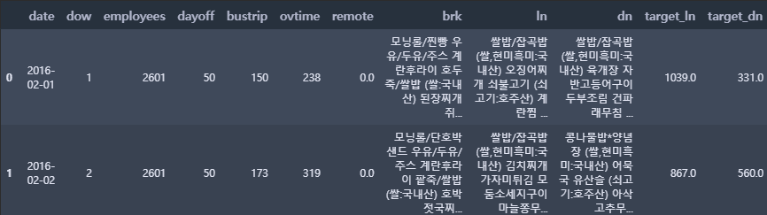
test.head(2)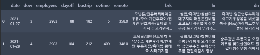
train.info()<class 'pandas.core.frame.DataFrame'>
RangeIndex: 1205 entries, 0 to 1204
Data columns (total 12 columns):
# Column Non-Null Count Dtype
--- ------ -------------- -----
0 date 1205 non-null datetime64[ns]
1 dow 1205 non-null int64
2 employees 1205 non-null int64
3 dayoff 1205 non-null int64
4 bustrip 1205 non-null int64
5 ovtime 1205 non-null int64
6 remote 1205 non-null float64
7 brk 1205 non-null object
8 ln 1205 non-null object
9 dn 1205 non-null object
10 target_ln 1205 non-null float64
11 target_dn 1205 non-null float64
dtypes: datetime64[ns](1), float64(3), int64(5), object(3)
memory usage: 113.1+ KB
test.info()<class 'pandas.core.frame.DataFrame'>
RangeIndex: 50 entries, 0 to 49
Data columns (total 10 columns):
# Column Non-Null Count Dtype
--- ------ -------------- -----
0 date 50 non-null datetime64[ns]
1 dow 50 non-null int64
2 employees 50 non-null int64
3 dayoff 50 non-null int64
4 bustrip 50 non-null int64
5 ovtime 50 non-null int64
6 remote 50 non-null float64
7 brk 50 non-null object
8 ln 50 non-null object
9 dn 50 non-null object
dtypes: datetime64[ns](1), float64(1), int64(5), object(3)
memory usage: 4.0+ KB
3.3 메뉴명
# 일별 점심메뉴를 작은 리스트로 갖고 있는 큰 리스트 (lunch) 만들기
lunch = []
for day in range(len(train)):
    tmp = train.iloc[day, 8].split(' ') # 공백으로 문자열 구분
    tmp = ' '.join(tmp).split()    # 빈 원소 삭제

    search = '('   # 원산지 정보는 삭제
    for menu in tmp:
        if search in menu:
            tmp.remove(menu)

lunch.append(tmp)lunch[0:5][['쌀밥/잡곡밥', '오징어찌개', '쇠불고기', '계란찜', '청포묵무침', '요구르트', '포기김치'],
['쌀밥/잡곡밥', '김치찌개', '가자미튀김', '모둠소세지구이', '마늘쫑무침', '요구르트', '배추겉절이'],
['카레덮밥', '팽이장국', '치킨핑거', '쫄면야채무침', '견과류조림', '요구르트', '포기김치'],
['쌀밥/잡곡밥', '쇠고기무국', '주꾸미볶음', '부추전', '시금치나물', '요구르트', '포기김치'],
['쌀밥/잡곡밥', '떡국', '돈육씨앗강정', '우엉잡채', '청경채무침', '요구르트', '포기김치']]
점심메뉴를 띄어쓰기로 나누었으며, 일별 점심메뉴를 하나의 리스트로 만들었다. 그리고 소괄호로 되어있는 원산지 정보가 삭제되어있는 것을 알 수 있다.
lunch[1065:1070][['쌀밥/잡곡밥', '매운소고기국', '굴비구이', '토마토프리타타', '도라지오이무침', '배추겉절이'],
['돈육버섯고추장덮밥', '팽이무국', '양파링카레튀김', '모듬어묵볶음', '참나물생채', '요구르트', '포기김치'],
['쌀밥/잡곡밥', '냉모밀국수', '매운돈갈비찜', '메밀전병*간장', '고구마순볶음', '포기김치', '양상추샐러드*딸기요거트'],
['쌀밥/잡곡밥', '대파육개장', '홍어미나리초무침', '어묵잡채', '콩자반', '배추겉절이', '양상추샐러드*오리엔탈'],
['카레라이스', '동태알탕', '부추고추전*간장', '쫄면야채무침', '과일요거트샐러드', '포기김치', '요구르트']]
어느날부터 김치와 사이드(샐러드, 요구르트 등)의 순서가 뒤바뀌어 있는 것을 확인할 수 있다. 이것을 참고해서 메뉴명을 추출해야 한다. 지금 보면, 1067번부터 순서가 바뀌어져 있는 것을 확인할 수 있다.
np.array(train[ (train.index > 1064) & (train.index < 1069)][['date', 'ln']])array([[Timestamp('2020-06-11 00:00:00'),
'쌀밥/잡곡밥 (쌀,현미,흑미:국내산) 매운소고기국 굴비구이 토마토프리타타 도라지오이무침 배추겉절이 (배추국내,고추가루:중국산) '],
[Timestamp('2020-06-12 00:00:00'),
'돈육버섯고추장덮밥 (쌀,돈육:국내산) 팽이무국 양파링카레튀김 모듬어묵볶음 참나물생채 요구르트 포기김치 (김치:국내산) '],
[Timestamp('2020-07-01 00:00:00'),
'쌀밥/잡곡밥 냉모밀국수 매운돈갈비찜 메밀전병*간장 고구마순볶음 포기김치 양상추샐러드*딸기요거트 '],
[Timestamp('2020-07-02 00:00:00'),
'쌀밥/잡곡밥 대파육개장 홍어미나리초무침 어묵잡채 콩자반 배추겉절이 양상추샐러드*오리엔탈 ']],
dtype=object)
그래서 순서가 변경된 날짜를 확인을 해보았다. (date, ln의 컬럼만을 추출해서 numpy로 출력)
20년 7월 1일부터 변경된 것을 확인할 수 있다.
3.3.1 각 메뉴 카테고리 별로 나누기
bob = []; gook = []; banchan1 = []; banchan2 = []; banchan3 = []; kimchi = []; side = []

for i, day_menu in enumerate(lunch):
    bob_tmp = day_menu[0]; bob.append(bob_tmp)
    gook_tmp = day_menu[1]; gook.append(gook_tmp)
    banchan1_tmp = day_menu[2]; banchan1.append(banchan1_tmp)
    banchan2_tmp = day_menu[3]; banchan2.append(banchan2_tmp)
    banchan3_tmp = day_menu[4]; banchan3.append(banchan3_tmp)

# 김치와 사이드의 순서가 변경되면서 아래와 같이 각 인덱스 순서를 달리하여 리스트에 할당함
    if i < 1067:
        kimchi_tmp = day_menu[-1]; kimchi.append(kimchi_tmp)
        side_tmp = day_menu[-2]; side.append(side_tmp)
    else:
        kimchi_tmp = day_menu[-2]; kimchi.append(kimchi_tmp)
        side_tmp  = day_menu[-1]; side.append(side_tmp)
# 밥, 국, 반찬, 김치, 사이드 컬럼을 추가함
train_ln = train[['date', 'dow', 'employees', 'dayoff', 'bustrip', 'ovtime', 'remote', 'ln', 'target_ln']]
train_ln['bob'] = bob
train_ln['gook'] = gook
train_ln['banchan1'] = banchan1; train_ln['banchan2'] = banchan2; train_ln['banchan3'] = banchan3
train_ln['kimchi'] = kimchi
train_ln['side'] = sidetrain_ln.iloc[1066:1070, 7:]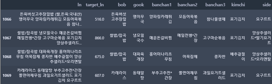
3.3.2 점심 메뉴 둘러보기
# 국
gook_df = pd.DataFrame(train_ln['gook'].value_counts().reset_index())
gook_df.head(10)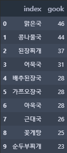
gook_df.tail(5)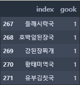
gook_df.gook.describe()count 272.000000
mean 4.430147
std 7.022545
min 1.000000
25% 1.000000
50% 1.000000
75% 5.000000
max 46.000000
Name: gook, dtype: float64
국의 종류를 확인할 수 있으며 국의 종류는 272개이다. 가장 많이 나온 국은 '맑은 국'으로 46번 나왔지만, 절반 이상이 단 1번만 나왔다.
# 반찬 1 ~ 3
train_ln[f'banchan1'][0:3]
0 쇠불고기
1 가자미튀김
2 치킨핑거
Name: banchan1, dtype: object
반찬 1의 3가지 데이터를 출력하였다.
banchan_list = []
for i in range(3):    # 반찬 1~3을 banchan_list에 추가
    tmp = train_ln[f'banchan{i+1}']
    for j in range(len(train_ln)):
        tmp2 = tmp[j]
        banchan_list.append(tmp2)

banchan_df = pd.DataFrame(pd.DataFrame(banchan_list).value_counts())  # 각 반찬 별 갯수
banchan_df.columns = ['banchan']   # banchan_list의 컬럼명
banchan_df.reset_index(inplace = True)  # 인덱스는 초기화
banchan_df.columns = ['index', 'banchan']

banchan_df.head(10)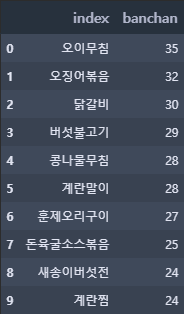
banchan_df.tail(4)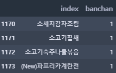
banchan_df.banchan.describe()count 1174.000000
mean 3.079216
std 4.371070
min 1.000000
25% 1.000000
50% 1.000000
75% 3.000000
max 35.000000
Name: banchan, dtype: float64
반찬의 종류는 1174개로 국에 비해 다양한 반찬이 제공되는 것을 알 수 있다. 가장 많이 나온 반찬은 35번이 나왔다. (그에 비해 가장 많이 나온 국은 46번이다.)
4. 간단한 시각화
train.head(2)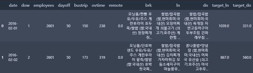
4.1 점심 및 저녁 이용자 수
fig, ax = plt.subplots(nrows = 1, ncols = 2, figsize = (18, 4))

sns.distplot(train["target_ln"], ax = ax[0], color = 'orange', kde = False, rug = True)  # 점심 이용자 수
sns.distplot(train["target_dn"], ax = ax[1], color = 'green', kde = False, rug = True)   # 저녁 이용자 수

plt.show()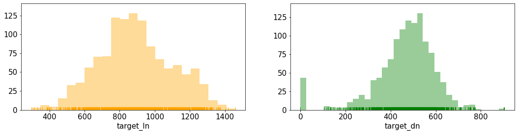
점심 이용자 수는 200명~1600명까지 넓게 펴져 있다. 그에 비해 저녁은 100명 ~ 800명 정도의 범위로 점심보다 저녁 이용자 수가 적은 것을 확인할 수 있다.
그 중 저녁 이용자 수 그래프를 확인해보면, 0명일 때의 날이 존재하는 것을 확인할 수 있다. (오류인지 확인해봐야 할 듯하다)
4.2 코로나
시계열 시각화를 통해 코로나 전후 간 차이가 있는지 확인
train.plot(x = 'date', y = ['target_ln', 'target_dn'], figsize = (40, 5))
plt.show()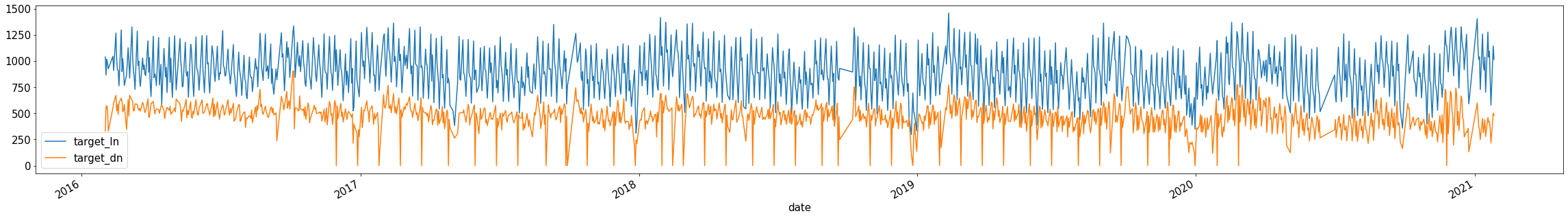
점심은 큰 특별한 패턴을 찾기는 어렵다.
저녁의 경우, 2016년 말부터 2020년 초반까지 이용자 수가 확 줄어드는 날(0명)이 있다. (위의 그래프에서도 확인이 가능하다) 이것은, 오류인지 확인해볼 필요가 있다. 그런데 2020년 초 이후부터는 0명이 되는 날이 거의 없는 것을 확인할 수 있다.
그리고 예상과는 다르게 코로나19 전후 간의 차이가 거의 없는 것으로 확인되었다.
4.2.1 코로나 전의 점심, 저녁 이용자 수
before_covid = train[train['date'].dt.year == 2019][['date', 'target_ln', 'target_dn']]
before_covid.plot(x = 'date', y = ['target_ln', 'target_dn'], figsize = (30, 5), grid = True)
plt.title('Before Covid19', fontsize = 25)
plt.show()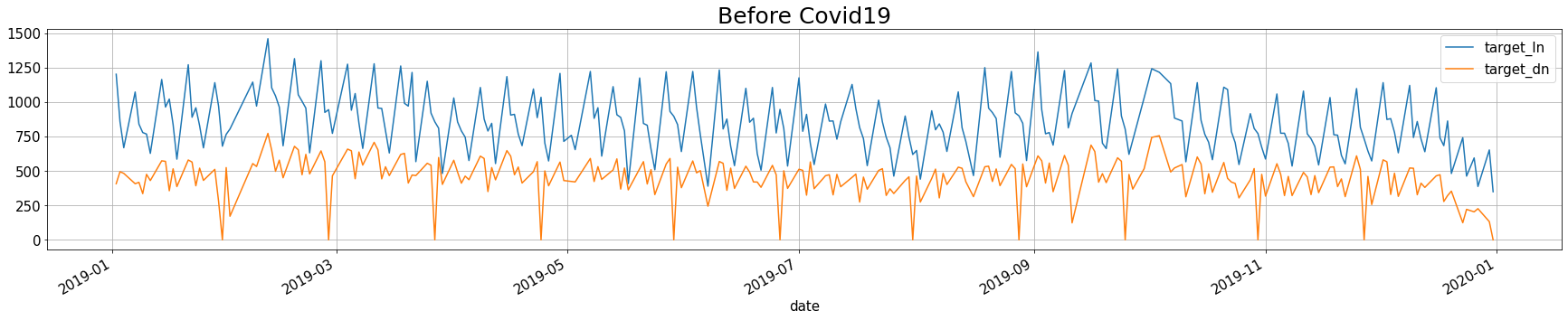
4.2.2 코로나 후의 점심, 저녁 이용자 수
after_covid = train[train['date'].dt.year >= 2020][['date', 'target_ln', 'target_dn']]
after_covid.plot(x = 'date', y = ['target_ln', 'target_dn'], figsize = (30, 5), grid = True)
plt.title('After Covid19', fontsize = 25)
plt.show()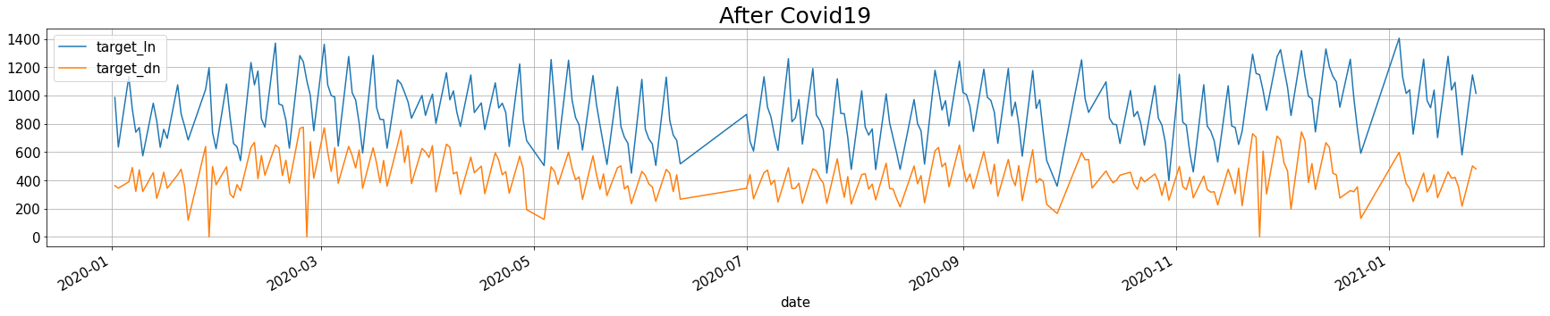
4.2.3 코로나 전후 점심, 저녁 이용자 수 평균
print('점심:', '2019년에는', round(before_covid.target_ln.mean(), 2), ', 2020년에는', round(after_covid.target_ln.mean(), 2))
print('저녁:', '2019년에는', round(before_covid.target_dn.mean(), 2), ', 2020년에는', round(after_covid.target_dn.mean(), 2))
점심: 2019년에는 850.51 , 2020년에는 890.97
저녁: 2019년에는 445.39 , 2020년에는 428.34
위의 평균을 확인해보았을 때, 코로나19가 큰 영향을 주진 않은 것 같다. 하지만 점심의 경우, 20년에 이용자 수가 증가하였다. 혹시나 20년동안 총 직원 수가 늘어나서 그런 것인지 확인을 해볼 필요가 있다.
4.2.4 직원 수 확인
train.plot(x = 'date', y = 'employees', figsize = (40, 8), c = "#e74c3c")
plt.title("Number of Employees", fontsize = 20)
plt.show()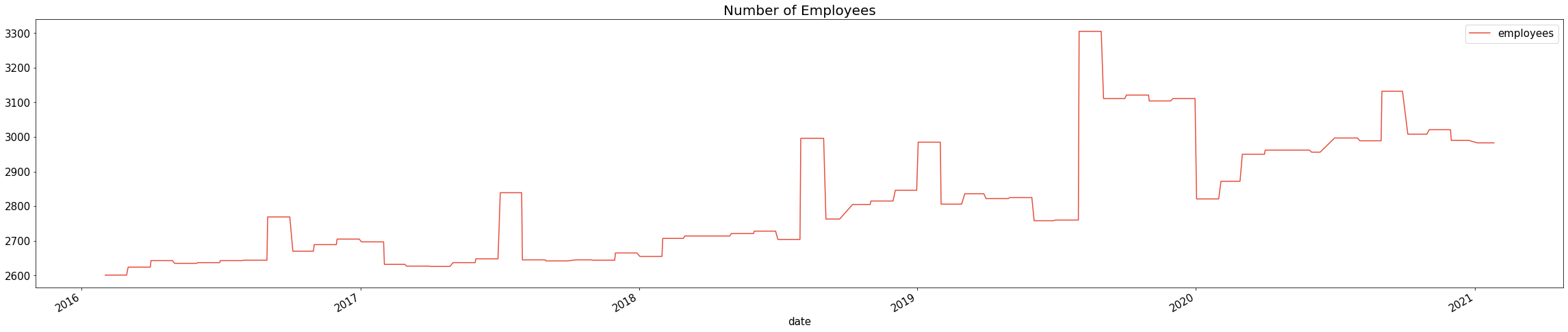
19년과 20년의 직원수를 비교해보아도 20년의 직원수가 확연히 많다고 단정지을 수 없다. 왜냐하면 19년도 하반기에 직원 수가 급증하였기 때문이다.
4.3 저녁 이용자 수 0명
히스토그램 그래프에서 저녁 이용자 수가 0명인 날이 있었는데, 오류인지 다른 이유가 있는지 확인해보고자 한다.
# 저녁 이용자 수가 0명인 날의 휴가자수, 출장자수, 시간외근무자 수, 재택근무자수, 요일, 저녁메뉴 확인
train[train.target_dn == 0][['date',  'dayoff', 'bustrip', 'ovtime', 'remote', 'dow', 'dn', 'target_dn']]
* 저녁 이용자 수가 0명이었던 이유
▶ 월 마지막 (또는 그 전 주) 수요일 (dow == 3)은 '자기개발의 날'이라 모두 정시퇴근 해야 하는 날으로 판단한다. 저녁 메뉴가 아예 없기 때문이다.
▶ 2017-09-27, 2018-02-14 해당 날짜들은 저녁 메뉴가 제공되지만 0명이다. 해당 날짜 전후로 달력을 확인해 본 결과, 2017-09-27은 추석 황금연휴 전 주이고 2018-02-14는 설날 연휴 전날이었다.
4.4 변수 간 상관관계
target_ln(점심 이용자 수), target_dn(저녁 이용자 수), employees(직원 수), dayoff(휴가자 수), bustrip(출장자 수), ovtime(시간 외 근무자 수), remote(재택근무자 수)
4.4.1 heatmap
train.head(2)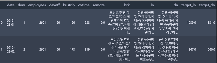
df = train[['target_ln', 'target_dn', 'employees', 'dayoff', 'bustrip', 'ovtime', 'remote']]
mask = np.triu(np.ones_like(df.corr(), dtype=np.bool))  # 위쪽 삼각형(상삼각행렬)에 마스크를 만든다
plt.rcParams['font.size'] = 15   # 차트의 기본 설정을 할 수 있음

fig, ax = plt.subplots(figsize=(16, 5))
sns.heatmap(df.corr(),
            annot=True,    # 실제 값을 표시
            cmap="BrBG",   # 색상
            mask = mask)   # 표시하지 않을 마스크 부분을 지정함
ax.set_title('Correlation Heatmap', pad = 10)
plt.show()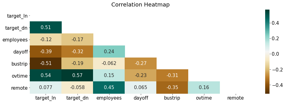
우리가 예측하고 싶은 종속변수는 target_ln(점심 이용자 수), target_dn(저녁 이용자 수)이다. 해당 변수들과의 상관계수가 0.4 이상이면 상관성이 높다고 할 수 있다.
- target_ln(점심 이용자 수)
- ovtime(0.54) : 양의 상관관계로, 야근을 하는 사람들이 점심 이용과 관련이 있음을 확인할 수 있다.
- bustrip(-0.51) : 음의 상관관계로, 출장을 간 사람들이 점심을 이용하지 않는 것과 관련이 있음을 확인할 수 있다.
- dayoff(-0.39) : 음의 상관관계로, 휴가인 사람들이 점심을 이용하지 않는 것과 관련이 있음을 확인할 수 있다.
- target_dn(저녁 이용자 수)
- ovtime(0.57) : 양의 상관관계로, 야근을 하는 사람들이 저녁 이용과 관련이 있음을 확인할 수 있다. 점심에 비해 저녁의 상관계수가 더 높다.
- dayoff(-0.32) : 음의 상관관계로, 휴가인 사람들이 저녁을 이용하지 않는 것과 관련이 있음을 확인할 수 있다.
- bustrip(-0.19) : 음의 상관관계로, 출장을 간 사람들이 저녁을 이용하지 않는 것과 관련이 있음을 확인할 수 있다.
np.triu
* L(하삼각행렬): 하삼각행렬만 0이 아닌 값이 있고, 대각행렬은 모두 0이어야 한다.
* U(상삼각행렬): 위의 삼각행렬을 제외하고 모두 0이어야 한다.
# 하삼각행렬
L = np.tril([[1,2,3],
            [4,5,6],
            [7,8,9]], k=-1)
I = np.identity(L.shape[0])
L = L + I

print(L)

[[1. 0. 0.]
 [4. 1. 0.]
 [7. 8. 1.]]
# 상삼각행렬
U = np.triu([[1,2,3],
[4,5,6],
[7,8,9]], k=0)
print(U)
[[1 2 3]
[0 5 6]
[0 0 9]]* np.triu : 상삼각행렬을 만들어주는 함수
* np.tril : 하삼각행렬을 만들어주는 함수
LU분해 5분컷 이해: python
대부분의 행렬A는 행렬을 일단 L(하삼각행렬 + 대각행렬은 1)과 U(상삼각행렬)로 분해가 된다. 분해를 왜하냐고 묻는다면, 일단 분해하고나면, A의 특성을 구하는데, 여러모로 행렬연산이 편해진
analytics4everything.tistory.com
상관관계 분석 시각화 - correlation matrix (df.corr, sns.heatmap)
변수간의 상관관계를 시각화 하는 방법에 대해 정리해보려고 합니다. 아래와 같이 만들어 보려고 해요 먼저...
blog.naver.com
plt.rcParams
rcParams 딕셔너리를 활용하여 그래프의 속성(그래프 선 모양, 색깔 등)을 고정으로 지정할 수 있다.
matplotlib의 구조와 rcParams에 대해 알면 나도 plot 고수 📈
Matplot의 구조 📈 데이터를 시각화 하기 위해서 Matplotlib 을 자주 사용합니다. 대부분의 사용자들이 세부적인 구조를 알지 못해 디버깅을 하는데 많은 시간을 소요하게 됩니다. 이번 포스팅에서
jrc-park.tistory.com
Customizing Matplotlib with style sheets and rcParams — Matplotlib 3.5.1 documentation
Tips for customizing the properties and default styles of Matplotlib. Setting rcParams at runtime takes precedence over style sheets, style sheets take precedence over matplotlibrc files. The matplotlibrc file Matplotlib uses matplotlibrc configuration fil
matplotlib.org
4.4.2 산점도
결과는 위의 heatmap과 동일하다.
fig, ax = plt.subplots(figsize = (18, 8), ncols = 4, nrows = 2, sharey=True)
plt.rcParams['font.size'] = 12
sns.color_palette("Paired")
train_features = ['employees', 'dayoff', 'bustrip', 'ovtime', 'employees', 'dayoff', 'bustrip', 'ovtime']
for i, feature in enumerate(train_features):
    row = int(i/4)
    col = i%4
    if i < 4:
        sns.regplot(x=feature, y = 'target_ln', data = train, ax = ax[row][col], color = 'salmon', marker = '+')
    else:
        sns.regplot(x=feature, y = 'target_dn', data = train, ax = ax[row][col], color = 'skyblue', marker = '+')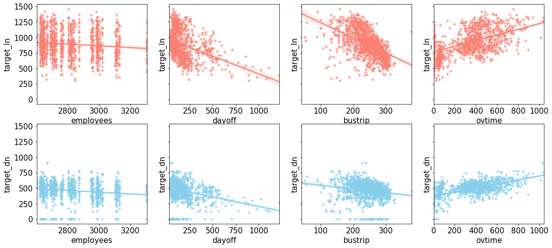
4.5 월별 & 요일별 패턴
해당 데이터셋에는 날짜 정보가 있으니 이것을 이용해 패턴을 확인해보고자 한다.
4.5.1 점심 및 저녁 이용자 수
heatmap을 활용하여 월별 & 요일별 점심과 저녁 이용자 수의 평균을 시각화해보았다.
tmp = train[['date', 'dow', 'employees', 'dayoff', 'bustrip', 'ovtime', 'remote', 'target_ln', 'target_dn']]
tmp['month'] = tmp['date'].dt.strftime("%m")   # 앞의 빈자리를 0으로 채우는 2자리 월 숫자로 변경

tmp_ln = tmp.groupby(['dow', 'month'])['target_ln'].mean().reset_index().pivot('dow', 'month', 'target_ln')
tmp_dn = tmp.groupby(['dow', 'month'])['target_dn'].mean().reset_index().pivot('dow', 'month', 'target_dn')
fig, ax = plt.subplots(nrows = 1, ncols = 2, figsize = (15, 4))
sns.heatmap(tmp_ln, cmap='RdYlGn_r', ax=ax[0])
ax[0].set_title('Lunch', pad = 12)
sns.heatmap(tmp_dn, cmap='RdYlGn_r', ax=ax[1])
ax[1].set_title('Dinner', pad = 12)
plt.show()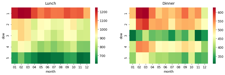
- 점심
- 월요일이 압도적으로 이용자 수가 많고 1년 내내 이러한 패턴을 보인다. 그 중에서도 2월, 3월이 더 많은 것으로 확인된다.
- 화요일, 수요일도 1000명 이상인 달이 있는데, 2월과 3월이다.
- 목요일, 금요일은 점심 이용자 수가 적다. 특히 금요일은 더 적은 것으로 확인된다.
- 저녁
- 점심과 마찬가지로 월요일이 가장 이용자 수가 많다. 그리고 화요일과 목요일이 이용자 수가 많다.
- 수요일의 저녁 이용자 수가 적은 이유는 '자기 개발의 날' 때문이다. 그렇기에 저녁 메뉴가 없는 데이터를 삭제 한 후, 다시 저녁 이용자 수 히트맵을 시각화해보기로 한다.
strftime() 메소드
* 날짜와 시간 정보를 문자열로 바꿔주는 메서드이다.
* 어떤 형식으로 문자열을 만들지 결정하는 형식 문자열을 인수로 받는다.
# 자기개발의 날 삭제
idx = train[train.target_dn == 0].index
tmp = train.drop(idx)
tmp['month'] = tmp['date'].dt.strftime("%m")
tmp_dn2 = tmp.groupby(['dow', 'month'])['target_dn'].mean().reset_index().pivot('dow', 'month', 'target_dn')

fig, ax = plt.subplots(nrows = 1, ncols = 2, figsize = (15, 4))

sns.heatmap(tmp_ln, cmap='RdYlGn_r', ax=ax[0])
ax[0].set_title('Lunch', pad = 12)
sns.heatmap(tmp_dn2, cmap='RdYlGn_r', ax=ax[1])
ax[1].set_title('Dinner - NEW', pad = 12)

plt.show()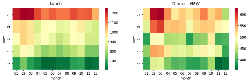
'자기개발의 날'을 제외시켰음에도 불구하고 수요일의 저녁 이용자 수가 적은 편이다.
▶ 점심과 저녁 이용자 수 모두 요일 별 패턴이 극명하게 보인다. 그렇기에 구내 식당 이용자를 예측할 때 '요일'이 중요한 요인이라고 할 수 있다.
4.5.2 회사에 있는 직원 수
요일 별, 월 별로 회사 내에 있는 직원 수가 얼마나 다른지 확인해보려고 한다. 회사에 있는 직원들이 잠재적으로 점심과 저녁을 먹을 사람들이기 때문이다. 그렇기에 회사 내의 직원수를 구하고자 한다.
이 전에, 휴가자수(dayoff), 출장자수(bustrip), 시간외근무자수(ovtime), 재택근무자수(remote)를 요일별 & 월별로 시각화하였다. (재택 근무자는 코로나 이전인 19년도까지는 0명이므로 20년 데이터만 시각화)
before = train['date'].dt.year < 2020
after = train['date'].dt.year >= 2020

train[before]['remote'].value_counts()  # 코로나19 전 재택근무자수
0.0 956
Name: remote, dtype: int64
before = train['date'].dt.year < 2020
after = train['date'].dt.year >= 2020

def heatmap_viz(df):
    df['month'] = df['date'].dt.strftime("%m")
    before = df['date'].dt.year < 2020
    after = df['date'].dt.year >= 2020

    tmp_dayoff = df.groupby(['dow', 'month'])['dayoff'].mean().reset_index().pivot('dow', 'month', 'dayoff')
    tmp_bustrip = df.groupby(['dow', 'month'])['bustrip'].mean().reset_index().pivot('dow', 'month', 'bustrip')
    tmp_ovtime = df.groupby(['dow', 'month'])['ovtime'].mean().reset_index().pivot('dow', 'month', 'ovtime')
    tmp_remote_after = df[after].groupby(['dow', 'month'])['remote'].mean().reset_index().pivot('dow', 'month', 'remote')

    fig, ax = plt.subplots(nrows = 1, ncols = 4, figsize = (30, 5), sharey = True)

    sns.heatmap(tmp_dayoff, cmap='Oranges', ax=ax[0])   #1
    ax[0].set_title('Dayoff', pad = 12)
    sns.heatmap(tmp_bustrip, cmap='Greens', ax=ax[1])   #2
    ax[1].set_title('Business Trip', pad = 12)
    sns.heatmap(tmp_ovtime, cmap='Blues', ax=ax[2])   #3
    ax[2].set_title('Overtime', pad = 12)
    sns.heatmap(tmp_remote_after, cmap='Purples', ax=ax[3])   # 4
    ax[3].set_title('Remote (2020-21 only)', pad = 12)

    plt.show()

df = train[['date', 'dow', 'dayoff', 'bustrip', 'ovtime', 'remote']]
heatmap_viz(df)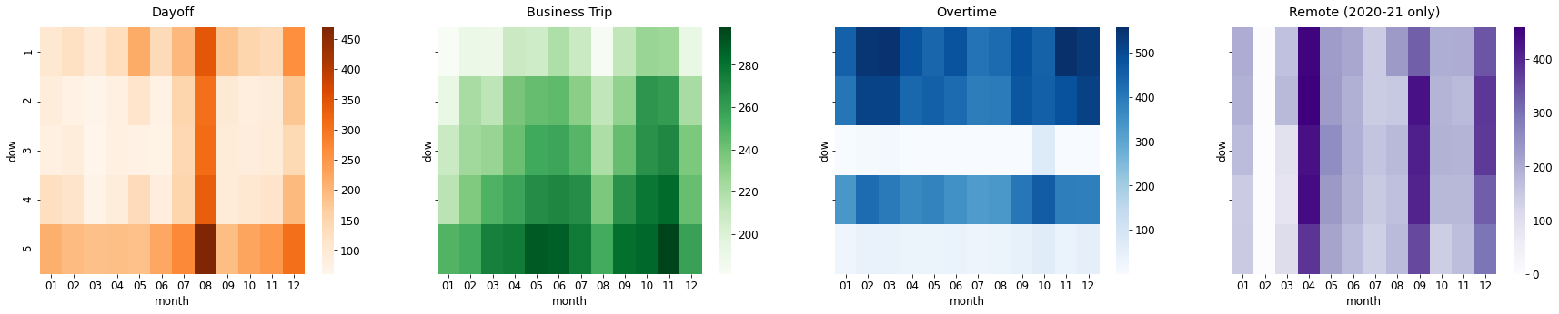
휴가자수, 출장자수, 시간외근무자수, 재택근무자수는 다 다른 패턴을 보인다.
- 휴가자수 : 월 & 금, 7, 8, 12월이 가장 많음
- 출장자수 : 금, 5, 6, 9, 10, 11월이 가장 많음 → 점심 이용자가 금요일에 적은 이유를 여기서 확인할 수 있음
- 시간외근무자수 : 월 & 화 & 목, 2, 3월이 가장 많음 → 저녁 이용자 수가 수, 금요일에 적은 이유를 여기서 확인할 수 있음
- 재택근무자수 : 4, 9, 12월이 가장 많음
회사 내에 있는 직원 수 = employees - (dayoff + bustrip + remote)
df = train[['date', 'dow', 'employees', 'dayoff', 'bustrip', 'ovtime', 'remote', 'target_ln', 'target_dn']]
df['in_office'] = df['employees'] - (df['dayoff'] + df['bustrip'] + df['remote'])
df['month'] = df['date'].dt.strftime("%m")
df.head(3)
tmp = df.groupby(['dow', 'month'])['in_office'].mean().reset_index().pivot('dow', 'month', 'in_office')

# Heatmap
fig, ax = plt.subplots(nrows = 1, ncols = 2, figsize = (20, 4))

sns.heatmap(tmp, cmap='YlGnBu', ax = ax[0])    # 1
ax[0].set_title('No. of Employees in Office', pad = 12)

df_corr = df[['target_ln', 'target_dn', 'employees', 'dayoff', 'bustrip', 'ovtime', 'remote', 'in_office']]   # 2
mask = np.triu(np.ones_like(df_corr.corr(), dtype=np.bool))
sns.heatmap(df_corr.corr(),
            annot=True,
            cmap="BrBG",
            mask = mask,
            ax =ax[1])
ax[1].set_title('Correlation Heatmap ("in_office" added)', pad = 10)
plt.show()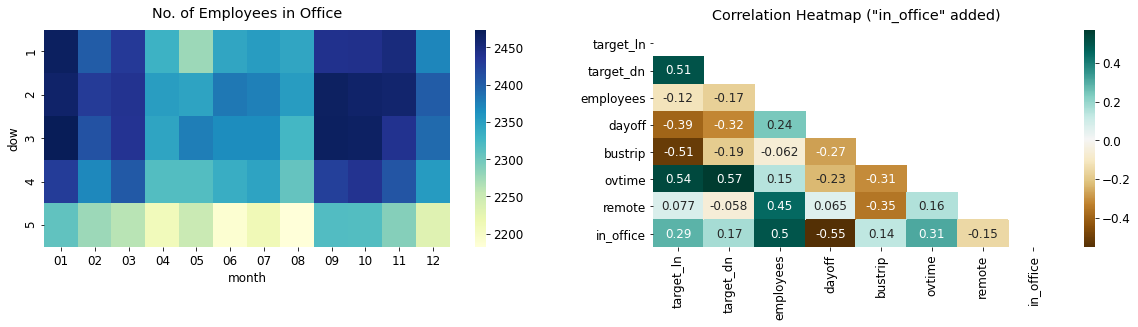
- 회사 내 직원 수(No. of Employees in Office)
- 금요일이 상대적으로 회사 내에 있는 직원수가 적다. (휴가자수와 출장자수가 금요일에 많았음)
- 1~3월, 8~11월에 회사 내에서 일하는 직원 수가 많은 것을 확인할 수 있다.
- 회사 내 직원 수와 종속변수와의 상관관계
- target_ln (0.29), target_dn(0.17)로 회사 내 직원 수와 종속변수(점심 이용자 수, 저녁 이용자 수)와 강한 상관관계는 아니다.
'Data Analysis > Kaggle 코드리뷰' 카테고리의 다른 글
| [Kaggle] House Prices - Advanced Regression Techniques (0) | 2022.06.30 |
|---|---|
| [Kaggle] H&M Personalized Fashion Recommendations (0) | 2022.04.13 |
| [Kaggle] Titanic(타이타닉) 생존자 예측 (0) | 2022.02.08 |