

- 대회 : https://www.kaggle.com/competitions/h-and-m-personalized-fashion-recommendations/overview
- 코드 : https://www.kaggle.com/code/vanguarde/h-m-eda-first-look/notebook
목차
1. First steps
2. Articles
3. Customers
4. Transactions
5. Images with description and price
Intro
이 대회는 H&M의 제품 추천을 받기 위해 열렸으며, 좋은 추천을 받을 수 있는 여러 종류의 데이터들이 있다.
📸 images - images of every article_id
🙋 articles - detailed metadata of every article_id
👔 customers - detailed metadata of every customer_id
🧾 transactions_train - purchases with details
1. First steps
데이터를 불러오자.
import numpy as np
import pandas as pd
import seaborn as sns
from matplotlib import pyplot as plt
from tqdm.notebook import tqdm
articles = pd.read_csv("../input/h-and-m-personalized-fashion-recommendations/articles.csv")
customers = pd.read_csv("../input/h-and-m-personalized-fashion-recommendations/customers.csv")
transactions = pd.read_csv("../input/h-and-m-personalized-fashion-recommendations/transactions_train.csv")
각 데이터를 세부적으로 살펴보자.
2. Articles
해당 데이터는 모든 H&M의 제품들에 대한 정보가 담겨있다.
제품의 유형, 색깔, 제품 그룹, 다른 특징들을 feature로 가지고 있다.
[Article 데이터의 feature]
- article_id : A unique identifier of every article.
- product_code, prod_name : A unique identifier of every product and its name (not the same).
- product_type, product_type_name : The group of product_code and its name\
- graphical_appearance_no, graphical_appearance_name : The group of graphics and its name
- colour_group_code, colour_group_name : The group of color and its name
- perceived_colour_value_id, perceived_colour_value_name, perceived_colour_master_id, perceived_colour_master_name : The added color info
- department_no, department_name: : A unique identifier of every dep and its name
- index_code, index_name : A unique identifier of every index and its name
- index_group_no, index_group_name : A group of indeces and its name
- section_no, section_name : A unique identifier of every section and its name
- garment_group_no, garment_group_name : A unique identifier of every garment and its name
- detail_desc : Details
articles.head()

'index_name' 별로 상품의 갯수를 시각화해보자.
f, ax = plt.subplots(figsize=(15, 7))
ax = sns.histplot(data=articles, y='index_name', color='orange')
ax.set_xlabel('count by index name')
ax.set_ylabel('index name')
plt.show()

Ladieswear이 전체 제품 중에 많은 부분을 차지하고 있으며, Sport가 가장 적은 부분을 차지하고 있다.
'garment_group_name'을 기준으로 'index_group_name' 별 비율을 얼만큼 차지하고 있는지 시각화해보자.
f, ax = plt.subplots(figsize=(15, 7))
ax = sns.histplot(data=articles, y='garment_group_name', color='orange', hue='index_group_name', multiple="stack")
ax.set_xlabel('count by garment group')
ax.set_ylabel('garment group')
plt.show()
'Jersey fancy'가 가장 많은 garment이다. 특히 그 중에서도 Ladieswear와 childern이 가장 많은 부분을 차지하고 있다.
'index_group_name'과 'index_name'을 groupby하여 'article_id'을 기준으로 갯수를 세어보자.
articles.groupby(['index_group_name', 'index_name']).count()['article_id']
index_group_name index_name
Baby/Children Baby Sizes 50-98 8875
Children Accessories, Swimwear 4615
Children Sizes 134-170 9214
Children Sizes 92-140 12007
Divided Divided 15149
Ladieswear Ladies Accessories 6961
Ladieswear 26001
Lingeries/Tights 6775
Menswear Menswear 12553
Sport Sport 3392
Name: article_id, dtype: int64
product group과 product의 구조를 살펴보자.
pd.options.display.max_rows = None        # 모든 행의 이름을 보여줌
articles.groupby(['product_group_name', 'product_type_name']).count()['article_id']
product_group_name product_type_name
Accessories Accessories set 7
Alice band 6
Baby Bib 3
Bag 1280
Beanie 56
Belt 458
Bracelet 180
Braces 3
Bucket hat 7
Cap 13
Cap/peaked 573
Dog Wear 20
Earring 1159
Earrings 11
Eyeglasses 2
Felt hat 10
Giftbox 15
Gloves 367
Hair clip 244
Hair string 238
Hair ties 24
Hair/alice band 854
Hairband 2
Hat/beanie 1349
Hat/brim 396
Headband 1
Necklace 581
Other accessories 1034
Ring 240
Scarf 1013
Soft Toys 46
Straw hat 6
Sunglasses 621
Tie 141
Umbrella 26
Wallet 77
Watch 73
Waterbottle 22
Bags Backpack 6
Bumbag 1
Cross-body bag 5
Shoulder bag 2
Tote bag 2
Weekend/Gym bag 9
Cosmetic Chem. cosmetics 3
Fine cosmetics 46
Fun Toy 2
Furniture Side table 13
Garment Full body Costumes 90
Dress 10362
Dungarees 309
Garment Set 1320
Jumpsuit/Playsuit 1147
Outdoor overall 64
Garment Lower body Leggings/Tights 1878
Outdoor trousers 130
Shorts 3939
Skirt 2696
Trousers 11169
Garment Upper body Blazer 1110
Blouse 3979
Bodysuit 913
Cardigan 1550
Coat 460
Hoodie 2356
Jacket 3940
Outdoor Waistcoat 154
Polo shirt 449
Shirt 3405
Sweater 9302
T-shirt 7904
Tailored Waistcoat 73
Top 4155
Vest top 2991
Garment and Shoe care Clothing mist 1
Sewing kit 1
Stain remover spray 2
Washing bag 1
Wood balls 1
Zipper head 3
Interior textile Blanket 1
Cushion 1
Towel 1
Items Dog wear 7
Keychain 1
Mobile case 4
Umbrella 3
Wireless earphone case 2
Nightwear Night gown 171
Pyjama bottom 220
Pyjama jumpsuit/playsuit 388
Pyjama set 1120
Shoes Ballerinas 372
Bootie 31
Boots 1028
Flat shoe 165
Flat shoes 10
Flip flop 125
Heeled sandals 202
Heels 22
Moccasins 4
Other shoe 395
Pre-walkers 1
Pumps 188
Sandals 757
Slippers 249
Sneakers 1621
Wedge 113
Socks & Tights Leg warmers 7
Socks 1889
Underwear Tights 546
Stationery Marker pen 5
Swimwear Bikini top 850
Sarong 66
Swimsuit 662
Swimwear bottom 1307
Swimwear set 192
Swimwear top 50
Underwear Bra 2212
Bra extender 1
Kids Underwear top 96
Long John 30
Nipple covers 19
Robe 136
Underdress 20
Underwear body 174
Underwear bottom 2748
Underwear corset 7
Underwear set 47
Underwear/nightwear Sleep Bag 6
Sleeping sack 48
Unknown Unknown 121
Name: article_id, dtype: int64
Accessories에 매우 다양한 종류가 있고 bag, earring, hat의 갯수가 많은 것을 확인할 수 있다.
각 컬럼 별로 유일한 value의 갯수를 확인해보자.
for col in articles.columns:
    if not 'no' in col and not 'code' in col and not 'id' in col:
        un_n = articles[col].nunique()
        print(f'n of unique {col}: {un_n}')
n of unique prod_name: 45875
n of unique product_type_name: 131
n of unique product_group_name: 19
n of unique graphical_appearance_name: 30
n of unique colour_group_name: 50
n of unique perceived_colour_value_name: 8
n of unique perceived_colour_master_name: 20
n of unique department_name: 250
n of unique index_name: 10
n of unique index_group_name: 5
n of unique section_name: 56
n of unique garment_group_name: 21
n of unique detail_desc: 43404
3. Customers
[customers 데이터의 feature]
- customer_id : A unique identifier of every customer
- FN : 1 or missed
- Active : 1 or missed
- club_member_status : Status in club
- fashion_news_frequency : How often H&M may send news to customer
- age : The current age
- postal_code : Postal code of customer
pd.options.display.max_rows = 50      # 인쇄 옵션 설정 / 50개의 행을 볼 수 있음
customers.head()
customers.shape[0] - customers['customer_id'].nunique()0
customers 데이터에 중복 데이터가 없는 것을 확인할 수 있다.
'postal_code'로 groupby하여 'customer_id' 별 갯수를 내림차순 한 후 확인해보자.
data_postal = customers.groupby('postal_code', as_index=False).count().sort_values('customer_id', ascending=False)
data_postal.head()
우편번호 당 비정상적으로 많은 고객이 있다. 아마, 물류센터나 픽업과 같은 주소로 인코딩된 것이라 생각된다.
비정상적으로 많은 고객의 수를 가지고 있는 우편번호를 가지고 있는 데이터를 확인해보자.
customers[customers['postal_code']=='2c29ae653a9282cce4151bd87643c907644e09541abc28ae87dea0d1f6603b1c'].head(5)
고객의 나이 분포를 확인해보자.
import seaborn as sns
from matplotlib import pyplot as plt
sns.set_style("darkgrid")
f, ax = plt.subplots(figsize=(10,5))
ax = sns.histplot(data=customers, x='age', bins=50, color='orange')
ax.set_xlabel('Distribution of the customers age')
plt.show()
20대 초반이 가장 많은 것을 확인할 수 있다.
고객들 중 H&M의 클럽 가입 여부를 히스토그램으로 시각화한 것을 확인해보자.
sns.set_style("darkgrid")
f, ax = plt.subplots(figsize=(10,5))
ax = sns.histplot(data=customers, x='club_member_status', color='orange')
ax.set_xlabel('Distribution of club member status')
plt.show()
대부분의 고객이 클럽에 가입되어 있고 몇 명은 클럽에 막 가입하여 활동 시작 중이다. 그리고 아주 극 소수로 클럽을 떠난 고객이 있는 것을 확인할 수 있다.
'fashion_news_frequency'에 데이터가 없다는 문구가 여러 개인 것을 위에서 확인할 수 있었다. 'fashion_news_frequency'에 있는 유일한 데이터를 확인해보자.
customers['fashion_news_frequency'].unique()array(['NONE', 'Regularly', nan, 'Monthly', 'None'], dtype=object)
데이터가 없다는 문구가 총 3가지가 있는 것을 확인할 수 있다. 이 3가지를 1개로 묶어서 나타내자.
customers.loc[~customers['fashion_news_frequency'].isin(['Regularly', 'Monthly']), 'fashion_news_frequency'] = 'None'
customers['fashion_news_frequency'].unique()
array(['None', 'Regularly', 'Monthly'], dtype=object)
데이터가 없다는 문구가 'None'으로 통일된 것을 확인할 수 있다.
'fashion_news_frequency' 별로 'customer_id'와 'fashion_news_frequency'를 groupby한 변수의 갯수를 pie_data 변수에 할당해보자.
pie_data = customers[['customer_id', 'fashion_news_frequency']].groupby('fashion_news_frequency').count()
위에서 할당한 pie_data를 pie 차트로 시각화한 것을 확인해보자.
sns.set_style("darkgrid")
f, ax = plt.subplots(figsize=(10,5))
# ax = sns.histplot(data=customers, x='fashion_news_frequency', color='orange')
# ax = sns.pie(data=customers, x='fashion_news_frequency', color='orange')
colors = sns.color_palette('pastel')
ax.pie(pie_data.customer_id, labels=pie_data.index, colors = colors)
ax.set_facecolor('lightgrey')
ax.set_xlabel('Distribution of fashion news frequency')
plt.show()
고객들이 최신 뉴스에 대해 메세지를 받기를 원하지 않는 것을 확인할 수 있다.
4. Transactions
[transaction 데이터의 feature]
- t_dat : A unique identifier of every customer
- customer_id : A unique identifier of every customer (in customers table)
- article_id : A unique identifier of every article (in articles table)
- price : Price of purchase
- sales_channel_id : 1 or 2
transactions.head()
'price'의 이상치가 있는지 확인해보자.
pd.set_option('display.float_format', '{:.4f}'.format)
transactions.describe()['price']
count 31788324.0000
mean 0.0278
std 0.0192
min 0.0000
25% 0.0158
50% 0.0254
75% 0.0339
max 0.5915
Name: price, dtype: float64
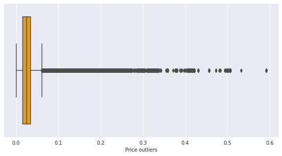
x축을 'price'로 지정하여 박스플롯으로 시각화한 것을 확인해보자.
sns.set_style("darkgrid")
f, ax = plt.subplots(figsize=(10,5))
ax = sns.boxplot(data=transactions, x='price', color='orange')
ax.set_xlabel('Price outliers')
plt.show()
거래 수의 TOP 10에 해당되는 고객을 출력해보자.
'customer_id'로 groupby한 것의 갯수를 센 것을 새로운 변수에 할당해주자.
transactions_byid = transactions.groupby('customer_id').count()
transactions_byid.sort_values(by='price', ascending=False)['price'][:10]customer_id
be1981ab818cf4ef6765b2ecaea7a2cbf14ccd6e8a7ee985513d9e8e53c6d91b 1895
b4db5e5259234574edfff958e170fe3a5e13b6f146752ca066abca3c156acc71 1441
49beaacac0c7801c2ce2d189efe525fe80b5d37e46ed05b50a4cd88e34d0748f 1364
a65f77281a528bf5c1e9f270141d601d116e1df33bf9df512f495ee06647a9cc 1361
cd04ec2726dd58a8c753e0d6423e57716fd9ebcf2f14ed6012e7e5bea016b4d6 1237
55d15396193dfd45836af3a6269a079efea339e875eff42cc0c228b002548a9d 1208
c140410d72a41ee5e2e3ba3d7f5a860f337f1b5e41c27cf9bda5517c8774f8fa 1170
8df45859ccd71ef1e48e2ee9d1c65d5728c31c46ae957d659fa4e5c3af6cc076 1169
03d0011487606c37c1b1ed147fc72f285a50c05f00b9712e0fc3da400c864296 1157
6cc121e5cc202d2bf344ffe795002bdbf87178054bcda2e57161f0ef810a4b55 1143
Name: price, dtype: int64
Accessories와 trousers 가격이 크게 다를 수가 있기에 그룹 내의 가격을 비교하는 것이 더 정확하다.
'article_id' feature를 기준으로 articles 데이터와 transactions 데이터를 병합해보자.
articles_for_merge = articles[['article_id', 'prod_name', 'product_type_name', 'product_group_name', 'index_name']]articles_for_merge = transactions[['customer_id', 'article_id', 'price', 't_dat']].merge(articles_for_merge, on='article_id', how='left')
x축은 'price', y축은 'product_group_name'으로 지정하여 boxplot으로 시각화한 것을 확인해보자.
sns.set_style("darkgrid")
f, ax = plt.subplots(figsize=(25,18))
ax = sns.boxplot(data=articles_for_merge, x='price', y='product_group_name')
ax.set_xlabel('Price outliers', fontsize=22)
ax.set_ylabel('Index names', fontsize=22)
ax.xaxis.set_tick_params(labelsize=22)
ax.yaxis.set_tick_params(labelsize=22)

plt.show()
Lower/Upper/Full body의 가격 차이가 큰 것을 확인할 수 있다. 캐주얼에 비해 독특한 컬렉션 제품일 수도 있을 것이다. 그리고 Accessories와 Shoes에 고가의 제품들이 있는 것을 확인할 수 있다.
Accessories product group 별 가격을 박스플롯으로 시각화한 것을 확인해보면 그룹 내 고가의 제품이 무엇인지 알 수 있다.
sns.set_style("darkgrid")
f, ax = plt.subplots(figsize=(25,18))
_ = articles_for_merge[articles_for_merge['product_group_name'] == 'Accessories']
ax = sns.boxplot(data=_, x='price', y='product_type_name')
ax.set_xlabel('Price outliers', fontsize=22)
ax.set_ylabel('Index names', fontsize=22)
ax.xaxis.set_tick_params(labelsize=22)
ax.yaxis.set_tick_params(labelsize=22)
del _

plt.show()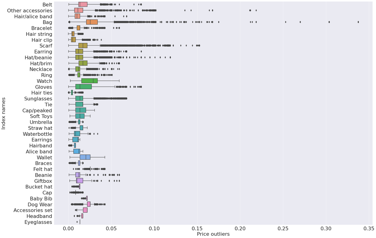
가장 큰 이상치가 Bag에 있다. 그리고 scarf와 other accessories도 다른 악세사리에 비해 고가의 제품이 있다는 것을 확인할 수 있다.
'index_name' 별로 평균 가격을 시각화한 것을 확인해보자.
articles_index = articles_for_merge[['index_name', 'price']].groupby('index_name').mean()
sns.set_style("darkgrid")
f, ax = plt.subplots(figsize=(10,5))
ax = sns.barplot(x=articles_index.price, y=articles_index.index, color='orange', alpha=0.8)
ax.set_xlabel('Price by index')
ax.set_ylabel('Index')
plt.show()
'Ladieswear'의 평균 가격이 가장 높고, 'children'의 평균 가격이 가장 낮은 것을 확인할 수 있다.
'product_group_name' 별 평균 가격을 시각화한 것을 확인해보자.
articles_index = articles_for_merge[['product_group_name', 'price']].groupby('product_group_name').mean()
sns.set_style("darkgrid")
f, ax = plt.subplots(figsize=(10,5))
ax = sns.barplot(x=articles_index.price, y=articles_index.index, color='orange', alpha=0.8)
ax.set_xlabel('Price by product group')
ax.set_ylabel('Product group')
plt.show()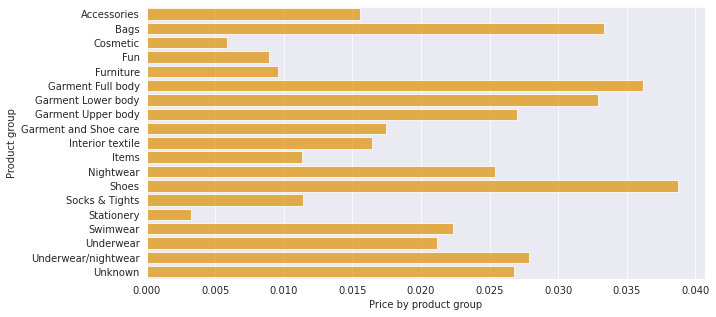
'shoes'의 평균 가격이 가장 높고, 'stationery'의 평균 가격이 가장 낮은 것을 확인할 수 있다.
평균가격이 높은 5개의 평균 가격 변화를 확인해보자.
▶ Shoes, Garment Full body, Bags, Garment Lower body, Underwear/nightwear
# 날짜를 datetime 형식으로 변경해줌
articles_for_merge['t_dat'] = pd.to_datetime(articles_for_merge['t_dat'])
product_list = ['Shoes', 'Garment Full body', 'Bags', 'Garment Lower body', 'Underwear/nightwear']
colors = ['cadetblue', 'orange', 'mediumspringgreen', 'tomato', 'lightseagreen']
k = 0
f, ax = plt.subplots(3, 2, figsize=(20, 15))
for i in range(3):
    for j in range(2):
        try:
            product = product_list[k]
            articles_for_merge_product = articles_for_merge[articles_for_merge.product_group_name == product_list[k]]
            series_mean = articles_for_merge_product[['t_dat', 'price']].groupby(pd.Grouper(key="t_dat", freq='M')).mean().fillna(0)
            series_std = articles_for_merge_product[['t_dat', 'price']].groupby(pd.Grouper(key="t_dat", freq='M')).std().fillna(0)
            ax[i, j].plot(series_mean, linewidth=4, color=colors[k])
            ax[i, j].fill_between(series_mean.index, (series_mean.values-2*series_std.values).ravel(),
                             (series_mean.values+2*series_std.values).ravel(), color=colors[k], alpha=.1)
            ax[i, j].set_title(f'Mean {product_list[k]} price in time')
            ax[i, j].set_xlabel('month')
            ax[i, j].set_xlabel(f'{product_list[k]}')
            k += 1
        except IndexError:
            ax[i, j].set_visible(False)
plt.show()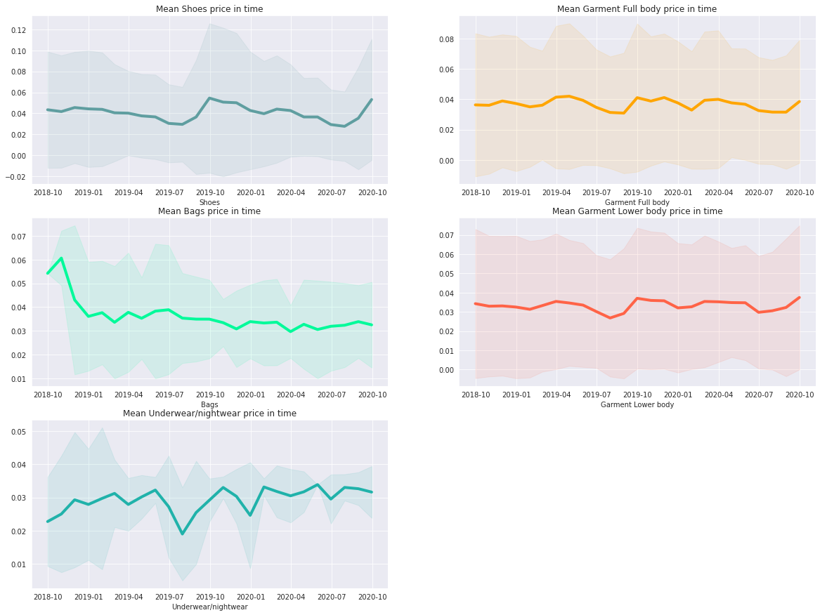
5. Images with description and price
마지막 구매의 최대 가격과 최소 가격을 확인해보자.
import matplotlib.pyplot as plt
import matplotlib.image as mpimg
max_price_ids = transactions[transactions.t_dat==transactions.t_dat.max()].sort_values('price', ascending=False).iloc[:5][['article_id', 'price']]
min_price_ids = transactions[transactions.t_dat==transactions.t_dat.min()].sort_values('price', ascending=True).iloc[:5][['article_id', 'price']]
TOP 5 최대 가격 제품의 가격과 설명이 있는 사진을 나타내보자.
f, ax = plt.subplots(1, 5, figsize=(20,10))
i = 0
for _, data in max_price_ids.iterrows():
    desc = articles[articles['article_id'] == data['article_id']]['detail_desc'].iloc[0]
    desc_list = desc.split(' ')
    for j, elem in enumerate(desc_list):
        if j > 0 and j % 5 == 0:
            desc_list[j] = desc_list[j] + '\n'
    desc = ' '.join(desc_list)
    img = mpimg.imread(f'../input/h-and-m-personalized-fashion-recommendations/images/0{str(data.article_id)[:2]}/0{int(data.article_id)}.jpg')
    ax[i].imshow(img)
    ax[i].set_title(f'price: {data.price:.2f}')
    ax[i].set_xticks([], [])
    ax[i].set_yticks([], [])
    ax[i].grid(False)
    ax[i].set_xlabel(desc, fontsize=10)
    i += 1
plt.show()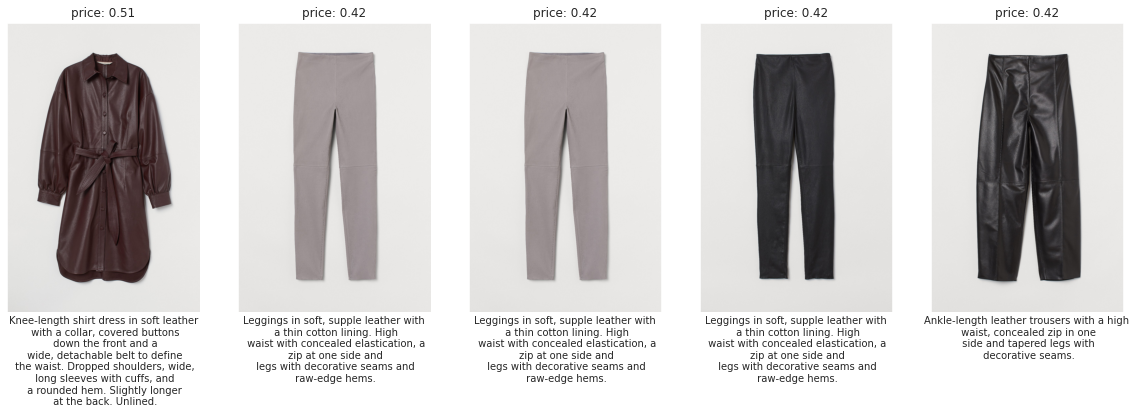
TOP 5 최소 가격 제품의 가격과 설명이 있는 사진을 나타내보자.
f, ax = plt.subplots(1, 5, figsize=(20,10))
i = 0
for _, data in min_price_ids.iterrows():
    desc = articles[articles['article_id'] == data['article_id']]['detail_desc'].iloc[0]
    desc_list = desc.split(' ')
    for j, elem in enumerate(desc_list):
        if j > 0 and j % 4 == 0:
            desc_list[j] = desc_list[j] + '\n'
    desc = ' '.join(desc_list)
    img = mpimg.imread(f'../input/h-and-m-personalized-fashion-recommendations/images/0{str(data.article_id)[:2]}/0{int(data.article_id)}.jpg')
    ax[i].imshow(img)
    ax[i].set_title(f'price: {data.price:.4f}')
    ax[i].set_xlabel(desc, fontsize=10)
    ax[i].set_xticks([], [])
    ax[i].set_yticks([], [])
    ax[i].grid(False)
    i += 1
plt.axis('off')
plt.show()
'Data Analysis > Kaggle 코드리뷰' 카테고리의 다른 글
| [Kaggle] House Prices - Advanced Regression Techniques (0) | 2022.06.30 |
|---|---|
| [Kaggle] Titanic(타이타닉) 생존자 예측 (0) | 2022.02.08 |
| [DACON] 구내식당 식수 인원 예측 AI 경진대회 (0) | 2022.02.02 |